Published 4 min read
The v2 base: a design system and a real blog
The portfolio grew from a single page into a sturdier base: its own design system, a Markdown blog, a warm light theme, and much smoother navigation.
- Changelog
- Release
- Design system
This version closes a long cycle of foundational work. Until now the site was a single animated page; v2.0.0 turns it into a sturdier base: a small design system, a real blog, and a structure ready to grow. From here on the project follows Semantic Versioning and every meaningful change lands in the changelog.
Think of it as the v2 base: the point where the next improvements begin.
Added
- A design system foundation. Color now comes from a single set of semantic
tokens —
surface,foreground,muted,border,primary,accent— wired through Tailwind and CSS variables. One change in one place re-themes the whole site. - A real blog at
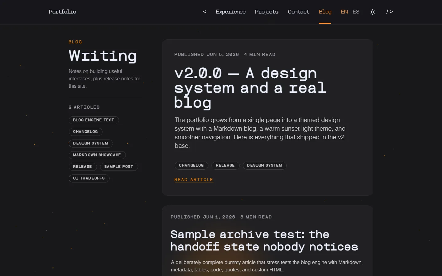
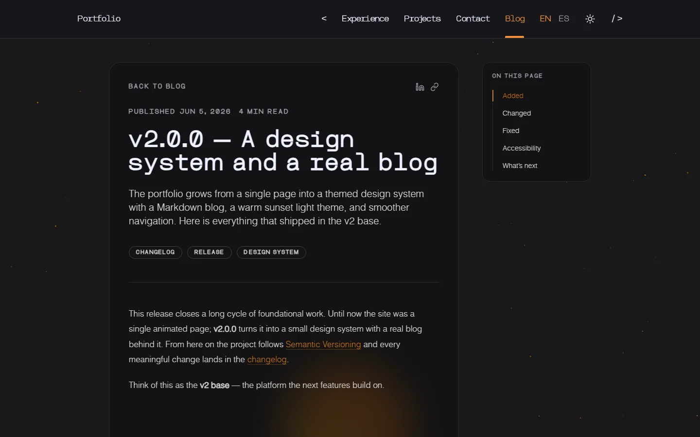
/blog. Posts are Markdown, rendered through a dedicatedProselayer, with a table of contents that follows the reading flow. In that first version, posts only showed a per-post EN/ES switcher when both translations existed. - Page transitions. Navigating now feels more continuous and less like a sequence of reloads.
- A livelier background. On desktop, a glow that follows the cursor now sits alongside another that floats on its own.
Changed
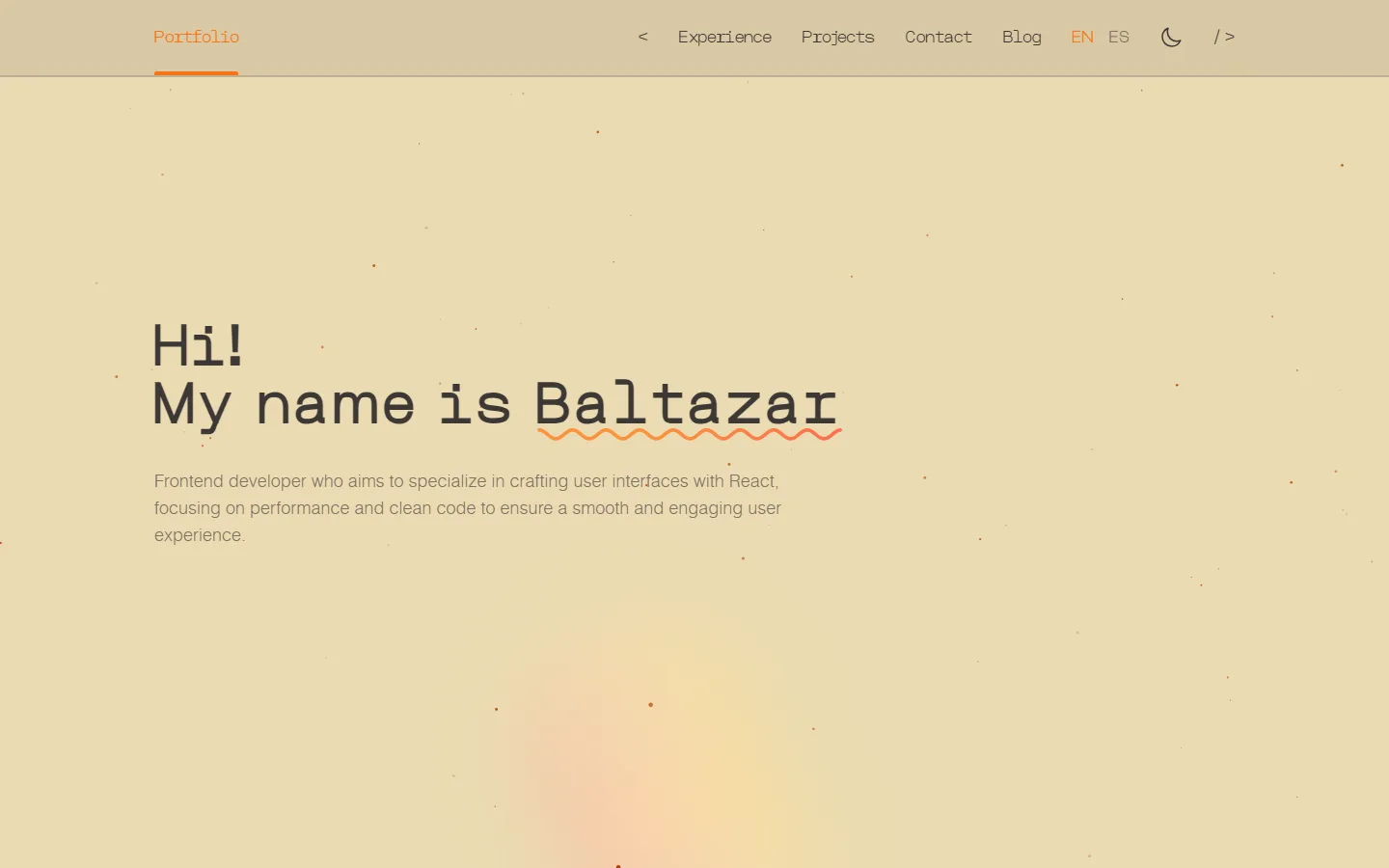
- A warm “sunset” light theme. The pale palette is gone. Light mode is now a warm, Gruvbox-inspired space: deep sand backgrounds, dark-brown text, and burnt-orange accents. Dark mode is untouched.
- Everything themed through tokens. Cards, header, drawer, blog, and reading styles no longer rely on hardcoded greys. They read from the tokens, so the system stays consistent.
Fixed
- The theme no longer flips while navigating. With page transitions, the stored theme is re-applied on every page change, so light/dark stays put.
Accessibility
- Blog cards can be opened as a whole. Using an accessible stretched-link pattern, the whole card acts as the main entry point while the tags and visible link still work independently.
- Consistent focus states and checked contrast. Focus states come from the tokens, and the light-mode accent was tuned to meet WCAG AA for text.
What shipped since v2.0
The v2 base did its job: improvements stopped fighting the foundation. Three smaller releases followed.
v2.1 — Sharing & SEO
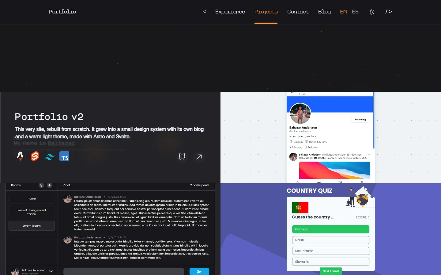
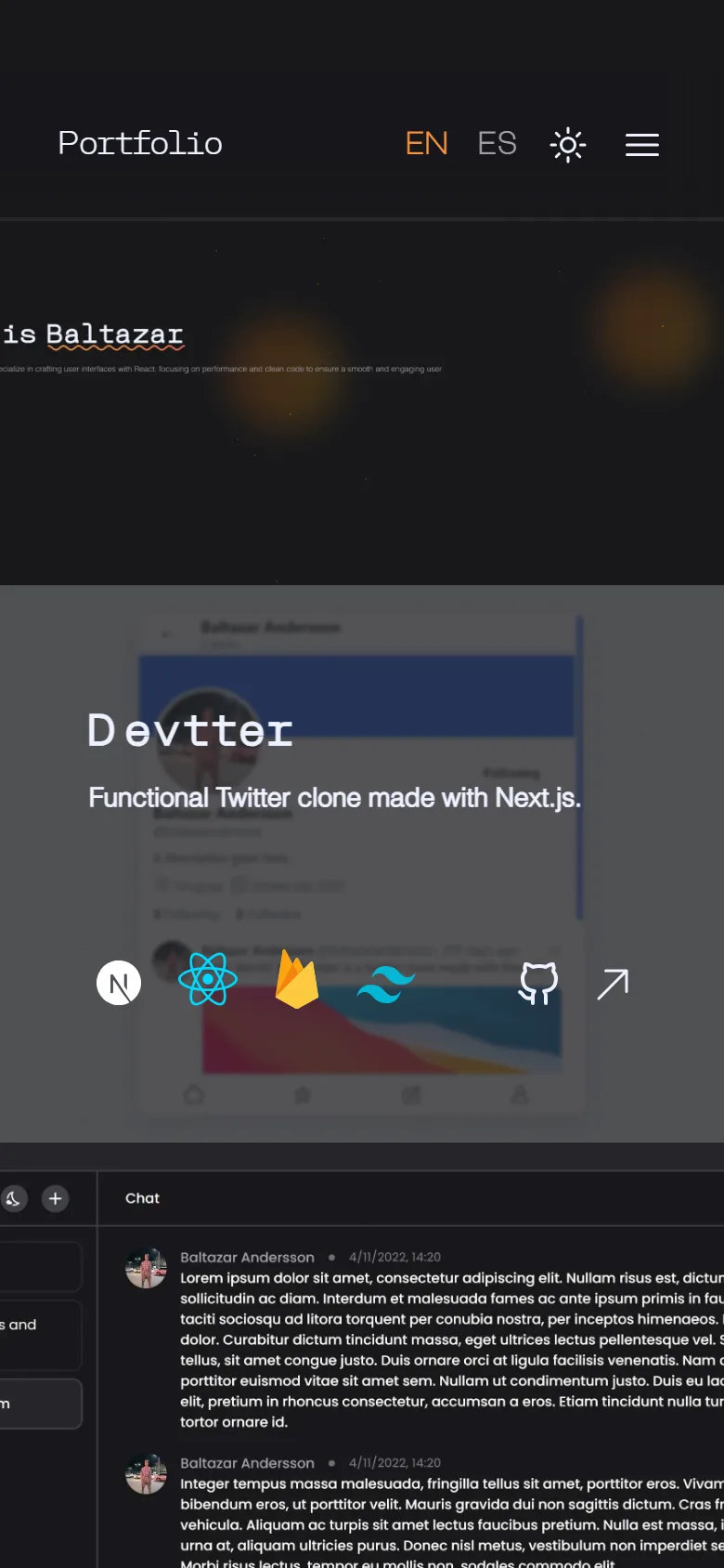
Posts now carry proper Open Graph and Twitter metadata, so shared links finally show a title, description, and image on LinkedIn and X. Each post can define its own share image, and the share button uses the native API on mobile and copies the link on desktop when needed. Projects got refreshed too: this site now has its own card, and on phones the list highlights one project at a time, whichever sits closest to the center of the screen.
v2.2 — Bilingual (EN/ES)
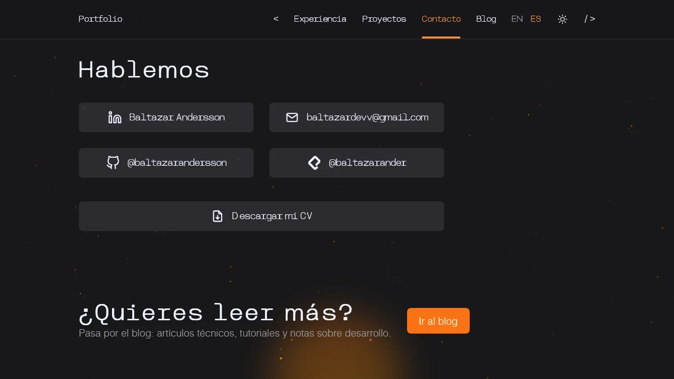
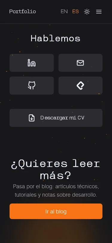
The whole site now lives in English and Spanish. English stays at the root,
Spanish under /es/, and a single switcher in the header changes the whole
experience: landing, blog, and navigation. It replaces the old per-post toggle,
which only showed up when a translation existed.
v2.3 — Professional experience
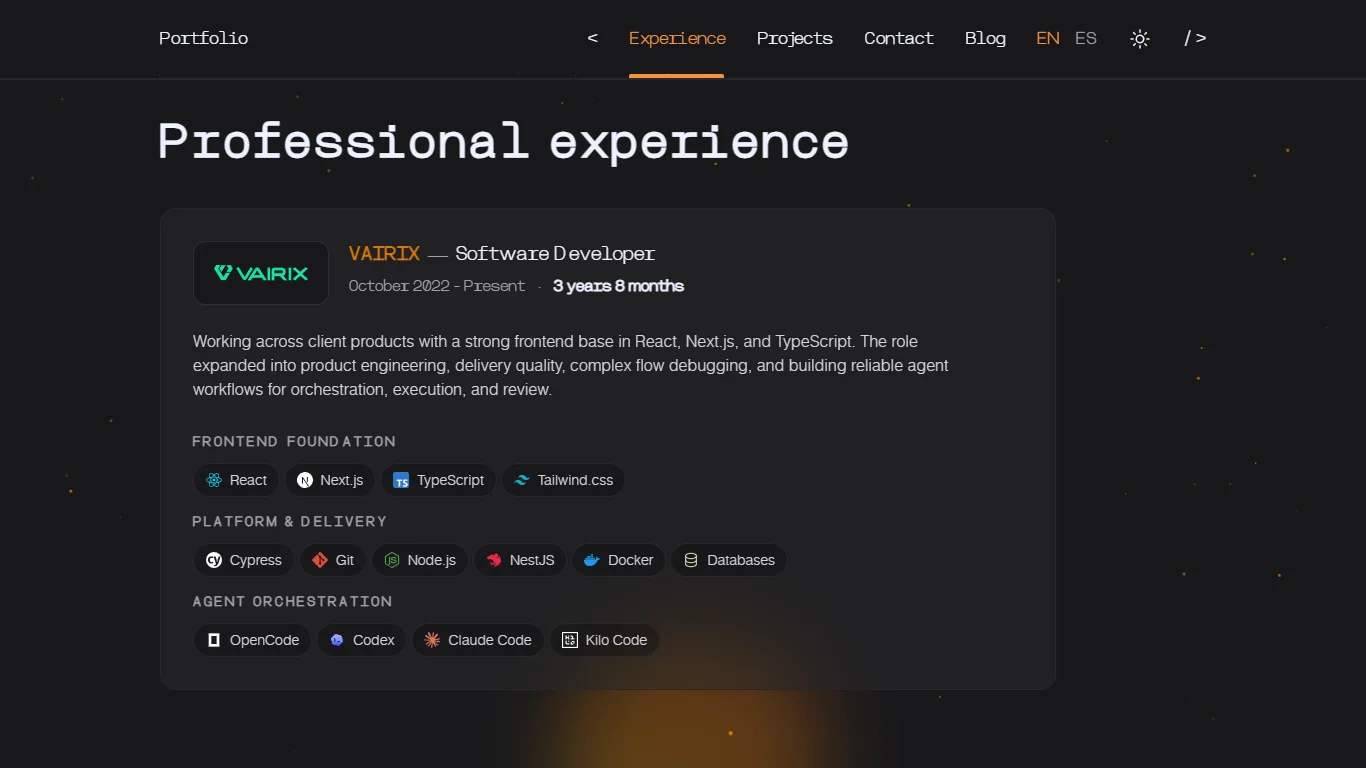
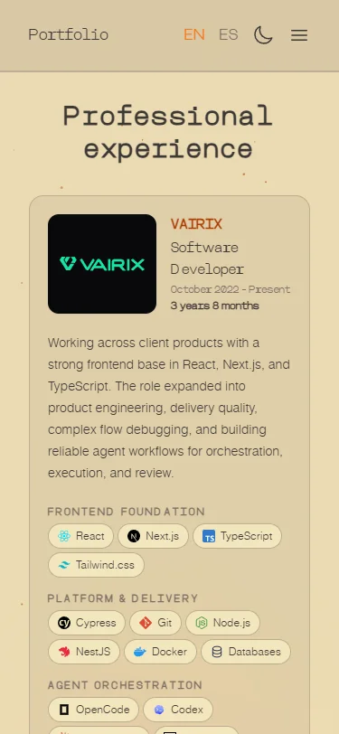
v2.3 gives professional experience its own place. It used to feel more diluted inside the landing; now it reads as a clear, easy-to-scan section with company, role, timeframe, work context, and technologies grouped by type. It also sends a more accurate profile signal: a strong frontend foundation that now expands into product engineering, delivery, and agent workflows.
What’s next
More written posts and continued polish. From here on, versions stay small and frequent.